

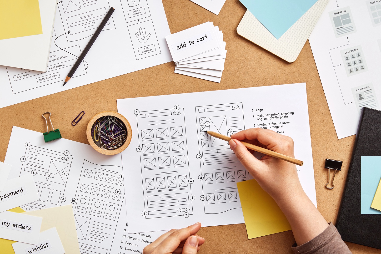
When someone lands on your website, they’re making first impressions and decisions almost immediately. Visitors aren’t reading every word on the page. They’re scanning for signals that tell them whether they’re in the right place and finding the information they need.
That’s why website layout best practices are about far more than aesthetics. A thoughtful layout creates a clear path through your content, helping visitors stay engaged instead of becoming overwhelmed or frustrated. Every section, heading and visual cue should make it easier for users to move naturally through the page.
When your website guides attention effectively, visitors spend less time searching and more time taking meaningful action.
People scan before they read
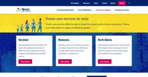
Most website visitors don’t read every word on a page. Instead, they quickly scan headlines, buttons, images and other visual cues to determine whether they’ve found the information they’re looking for.
A strong website visual hierarchy supports this natural behavior by organizing information according to importance. Larger headlines, descriptive subheadings and clear calls to action make it easier for visitors to understand the page and decide where to focus next.
Rather than forcing users through large blocks of text, your website should help them quickly identify:
- What your business offers
- Why it matters
- What they should do next
The easier it is for visitors to find answers, the more likely they are to continue exploring your website.
Pro tip: Before publishing a page, glance at it for five seconds without reading. If you can immediately identify the page’s purpose and the next action, visitors likely can too.
White space isn’t empty space
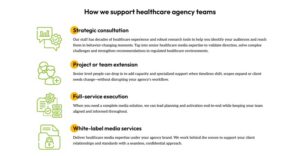
One of the biggest misconceptions in web design is that every inch of the screen needs to contain information.
In reality, strategic content spacing improves readability by giving users room to process what they’re seeing. White space separates ideas, highlights important content and prevents pages from feeling cluttered.
A cleaner layout also helps important elements stand out. Calls to action become more noticeable. Headlines become easier to scan. Images support the content instead of competing for attention.
Sometimes adding space improves a page more than adding additional content.
Pro tip: If a page feels crowded, resist the urge to shrink text or images. Increasing spacing often creates a more comfortable reading experience.
Good flow removes friction
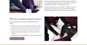
Every page should guide visitors naturally from one section to the next.
Effective website user experience depends on creating a logical progression that anticipates users’ questions. Instead of making people search for information, each section should build on the previous one.
For example, a service page might begin with the customer’s challenge before introducing your solution. From there, supporting details, proof points and a call to action create a smooth journey without unnecessary interruptions.
When content flows naturally, visitors stay focused because they’re never wondering where to look next.
Pro tip: Review your pages from the perspective of a first-time visitor. If you find yourself asking, “What comes next?” your users probably will too.
Readability influences engagement
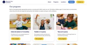
Even valuable information can be overlooked if it’s difficult to read. Improving website readability often comes down to small design decisions that have a significant impact, including:
- Short paragraphs that are easier to scan
- Clear headings that organize information
- Adequate line spacing for comfortable reading
- Consistent typography throughout the page
- Bullet points that simplify complex information when appropriate
These elements work together to reduce cognitive effort, allowing visitors to absorb information quickly without feeling overwhelmed.
Pro tip: Read your page on a mobile device before publishing. If it feels difficult to scan on your phone, your audience will likely have the same experience.
Accessible website design benefits everyone
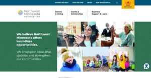
Good design isn’t just visually appealing. It should also be usable by as many people as possible.
Building website accessibility into your website user experience benefits individuals with visual, auditory, cognitive and motor disabilities while also creating a smoother experience for every visitor. Clear heading structures, sufficient color contrast, descriptive link text and keyboard-friendly navigation all make content easier to understand and interact with.
Accessibility also complements strong layout and visual flow. When information is organized logically and presented consistently, users can find what they need faster, regardless of how they access your website. Beyond improving usability, accessible websites can support SEO and help organizations meet evolving accessibility expectations.
Pro tip: Accessibility isn’t a one-time checklist. Review your website regularly to ensure new content, images and design updates continue to meet accessibility best practices.
Mobile users notice layout even more
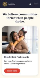
With most website traffic now coming from mobile devices, thoughtful responsive website design has become essential.
What works well on a desktop screen doesn’t always translate to a smartphone. Large text blocks, oversized images or tightly packed content can quickly create frustration on smaller displays.
Designing with mobile in mind means considering how visitors scroll, tap and consume information on every device. Pages should remain easy to navigate without requiring excessive zooming, pinching or searching.
A consistent experience across devices helps visitors stay engaged no matter how they access your website.
Pro tip: Test your website on several screen sizes and platforms (Apple vs Android) not just your own device. Small layout issues can have a big impact on engagement.
Great design supports business goals
The most effective websites don’t demand attention. They earn it by making every interaction feel intuitive.
Thoughtful layout, intentional spacing and a clear visual flow help visitors quickly understand who you are, what you offer and where to go next. Combined with accessible, responsive design, these elements create an experience that builds confidence, reduces frustration and encourages meaningful engagement.
Whether your goal is generating leads, increasing online sales or simply making information easier to find, designing for the way people actually use websites can have a measurable impact on your results.
At Flying Orange, we believe great web design is about more than appearance. We partner with businesses, nonprofits and organizations to create custom websites that balance beautiful design with usability, accessibility and performance. If your current website feels cluttered, difficult to navigate or isn’t converting visitors into customers, let’s start a conversation. Together, we can build a website that captures attention, guides users with purpose and supports your business long after the first click.

Flying Orange has been a trusted development resource since 2007, meaning we’ve seen our fair share of design trends. Feel free to reach out for a free quote. We’re here to help with both ongoing, monthly website maintenance, or full website redesigns. We would love to learn more about your needs.